Showing posts with label How-to. Show all posts

Wednesday, 20 November 2013

Blogging and Photoshop

TF: Prime Deluxe Bumblebee
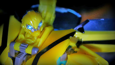
Since starting this blog I've been evolving the way I use my collection - from initially wanting to document each figure as I purchased it (on my way to building a Jabba's Palace display), to then wanting to focus on diorama building; however I've since found that the one constant has been actually photographing the toys, and creating images that attempt to show these characters at their best. The shot of Bumblebee above is my most recent, and I'd like to share some of the techniques I used to create it...

Firstly, the kit - I shoot on a Canon 600D DSLR, usually using the 18-55mm 'kit' lens, but sometimes a 50mm (although this generally only works for larger objects). This is my equipment for my day job as a filmmaker though, and something that I've worked up to. My initial forays into toy photography were on a Canon Powershot, and photographers such as R2witco take a lot of their stuff on camera phones. Basically, as long as you've got a macro function (often displayed as a flower on the camera settings) and can find a way to set the focus where you need it, then your camera is suitable for the job.
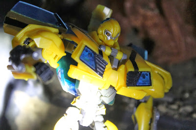
One of Many
This shot was an unused take from the session which yielded the final image. Here it shows more clearly the background, which is the old fireplace in my study. Whilst barely recognisable as anything, the important thing for an action figure shot is that it doesn't look like a house. Nothing kills the 'reality' of a Dinobot shot more than Grimlock being out scaled by a potted plant. What the above shot also shows is the lighting setup I was employing - basically, one torch. There was a little bit of light from the window (it was dusk), but that torch was my primary light source. I wouldn't encourage shining the light directly onto your subject like that, but I knew I would be cropping the image anyway (more on that later).

I'm often lazy with lighting, either taking the figures outside or shooting around the office window (nothing beats indirect sunlight as a light source), but taking the time to create a proper lighting setup often works wonders - see my PAK Batman shots here. I think it's to do with cast shadows, which helps to integrate the figure into the environment and in turn create a sense of reality. It's something I'm going to work on, especially as winter descends and daylight becomes scarce.
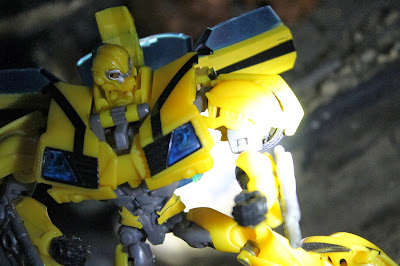
And Another...
What I consider the most important point of action figure photography is to GET LOADS OF SHOTS. Whenever you have a setup, go trigger happy - I'm gonna presume that you're shooting on digital so the cost of film isn't an issue. I find that it takes me a little while to get 'warmed up' to a subject, and really get an idea of what works. Mess around with your angles, the pose of your figure(s) and experiment with what you want to focus on - and even after you think you've got the shot that you're after, get a couple more. You may surprise yourself. The other thing to remember is that cropping is your friend - you might be gutted that the stand for your figure is just visible in the frame, but with a crop and a re-composition it could still be the perfect photo.
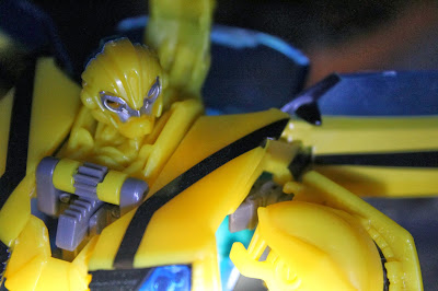
The 'One'.
When I had the shot of 'Bee that I was after, the fun part started. Firstly I opened the image in Photoshop (Paint.net is a superb free alternative if you don't have access to this), and then I did a quick Google search and found this rather superb guide to creating eye FX on the TFW2005 forums. Thank you, Process - if that is your real name...

After the eyes were completed I imported the image into Picmonkey, my editing suite of choice. Here I cropped the image to a 1920x1080 resolution (my usual canvas size), and then played around with the exposure, saturation and sharpness settings to get a base image I was happy with. Using these tools really does require trial and error, as well as a degree of personal preference, but it's at this stage that the image really starts to come alive. I should also note that you can use the colour settings on Picmonkey to fix the white balance, which is always useful - simply use the neutral picker and select the part of the image that should be as close to pure white or black as possible, and it will shift the colour tones accordingly. Again this takes practise, but when you get the hang of it it's a valuable tool. 
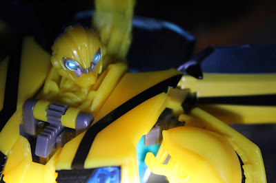
The Glow!
When I was happy with the core picture I used some of Picmonkey's various filters to complete the image, as seen at the top of this post. Once more this comes down to experimentation and personal preference as to how you want your image to look, but there are some pretty cool filter options on there. Really editing is all about how you want the image to look, and finding ways of making it happen. I've been doing this for a few years now and I still haven't found one particular style that I've made my own (look at Ed Speir IV's work for examples of instantly recognisable photos), but I'm definitely developing my skills, and I think that a style will come with that eventually.

There it is then, a few of the tips that I've picked up when it comes to action figure photography. I hope you find them useful... Now go and take some shots!

Saturday, 27 October 2012

Cutting It Down to Size


As it's the beginning of study week, I've been able to take an hour or so and crack open the ESB Blu Ray pack. Well, I say crack open the pack; so far I've only punched Snowspeeder Luke out of the blister! That's not for any negative reasons though; in fact it's quite the opposite - this guy is awesome! Further to that, when POTF2 was released, this Luke was the first figure I bought, closely followed by R2 D2, and they became the focal point of most of my adventures. As such, it was nice to re-create the feeling for a little while before getting overwhelmed with Boba Fetts and Princess Leias...

Anyway, I made a little set, messed around with the lighting and got a few shots. There weren't any where I thought straight away 'that's it!', which is normally a troubling sign, but there were enough maybes to work with, so I got the images onto my computer and produced the picture above. Now, I like it - the pose works, the shadows on Luke are nice, the composition is solid - but I was just bugged by the shadow on the wall. And that's the problem: because of that shadow, you know that's a wall. Instant scene killer. The solution?

Well, how about a drastic crop?


By re-centering and trimming the image, I turned a flawed scene into what I think is a decent portrait. It may not be what I had in mind when I broke Luke out tonight, but it's still the best shot I think I could've got, and highlights the detail of this excellent figure.

Tuesday, 4 September 2012

Autobots & Backdrops

RTS Special Ops Jazz
This is photography 101 right here - last week I finally got around to spending the 35p needed to buy a sheet of black sugar paper to use as a backdrop for action figure shots, and then today I finally got the time to snap a couple of pictures...

Autobots!
The shots above were naturally lit from the window opposite. I got pretty even lighting but I could have used a reflector to bounce some light on to the backsides of the figures. Following the shoot, I made crops and adjusted the colour in Windows 7 picture manager before exporting the images to my phone, and then used the photo manager app to finish them off. I only recently started doing this kind of dual-processing, and that's mainly with Transformers shots; firstly because they're so colourful and bold that they make great subjects, and secondly because I really am figuring this all out as I go!

I tried a set up this evening after dark and using a couple of lamps, but couldn't get any results I was happy with. Regardless, I found a particular line-up of Autobots I like...

Dark Autobots!
The amount of colour correction required on this image really washes the colour out, but I've yet to find a way to manually adjust the white balance on my camera outside of a couple of presets. For that reason, until I get a better lamp set-up and more lighting skills, I'll be sticking to daylight shots!

Reasonably well-adjusted Autobots!
In general I'm happy with the results though. A neutral background such as this really brings the figures to the fore, and I can see myself going this route for reviews in the future.

Friday, 10 August 2012

Building the Box: Two


Welcome to Part Two of my how-to guide to building the Dagobah Box! Part One is here if you want to get caught up, otherwise, let’s get going!


Before properly fixing the tree into place, I needed to decide upon a background. I’d originally wanted to paint my own background, and did a quick mock up with pastels, but wasn’t really happy with the effect. I also tried a print out of a dark, Dagobah swamp-esque image, but the colours and scale didn’t really match. After trial and error with these images, I eventually settled on the image from the film (and the OTC box-art), showing Luke’s partially sunken X-Wing in the distance. 

Pen & Pastel Backdrop
Generic Swamp Backdrop
I dry-brushed the floor of the box with dark green acrylic paint to to help achieve the swamp effect, and then added more branches to the tree, twisting some regular garden twine around the branches to form vines, and covered it in moulding plaster to add texture and hold it all together. When this was complete I spray painted it brown again, dry brushed it dark green, and fixed it properly into place.

It's come a long way from being a toilet roll tube...
Whilst the spray paint is absolutely the best tool to work with for diorama building (I’m converted!), the gloss left quite a singular, damp look to the floor. To add texture I bought some modelling flock (autumn leaves, if I remember correctly), and used PVA glue to apply it to certain areas of the floor and tree.

Pre-flock...
Almost finished. I cut some holes in the top of the box and poked through some vines from my garden on the opposite side of the tree, and used more modelling clay to add texture. I once again used a base layer of dark brown acrylic paint, dry brushed with dark green, and it was done!

...And finished!
And so, I’ve had it for some time – what do I think of the Box as a set for photography, or as a display piece now? What would I do differently? Well, thank you for asking… :D


As a set, the box has worked well for pictures, but also pretty much served its purpose. As it’s such a small scene, and I can only really photograph in one direction, there isn’t too much more I can do with it. The sides and roof of the box are essential in creating the mood of Dagobah, but unfortunately they limit the lighting options – all I can really do is flood the front with light, whilst trying to avoid too much reflection from the background image.


As a display piece, the box is a bit of a mess. Whilst the scene is suitable, the cardboard box warped as soon as I applied the papier mache, and the shape has become further distorted through applications of paint and wet plaster. I’ve had it sat out on my display shelf before, and as happy as I am with the scene, the presentation looks amateurish. I will absolutely use wood or polystyrene for future displays.

Aside from the materials, I was disappointed with myself for not putting the effort in to paint a custom backdrop. The location of the X-Wing in the background messes up the screen accuracy of the scene, and if you follow the lake from the background it should actually flow right into the box itself! Those two points aside though, I don't think it works that badly.


The most important thing I’ve learned from building the Dagobah Box is that a scene or diorama needs to have a specific purpose from the beginning – be it for screen accuracy, display, play or whatever. I made a lot of choices on the fly whilst making this, and the overall look has suffered. I’ve since made a generic display piece, and having made it for a definite purpose, the final effect is much better. If, and when, I embark on a Dagobah scene again, I fully intend to make it scene specific, use appropriate materials, and hopefully end up with a more satisfactory end result.

Sunday, 5 August 2012

Building the Box: One


The Dagobah Box is the most ambitious set-piece I’ve made so far; and whilst I’ve thought of many ways to make it better (or to improve version two…) since finishing it, it still works great as a display piece for my Dagobah-themed figures. Here, long overdue for both the Box and this blog, I present a making-off guide, with plenty of WIP shots!

Calvin & Hobbes: Essential reading for everyone.
First of all I found an ordinary shoebox, as inspired by Calvin’s diorama school project. The first challenge for me was to decide which part of Dagobah I wanted to show. The box wasn’t big enough for my POTF2 X-Wing, so I ruled out doing the crash site. I considered making Yoda’s hut, but the box dimensions would have made it really squashed, so that was scratched also. I knew I would primarily be using the set to display the OTC Dagobah wave figures, and so, following a lot of research (by which I mean the hardship of watching Empire Strikes Back :D), I decided on the clearing where Luke has the vision of Cloud City.


I made the tree by selecting several suitable branches from my garden, and chopping them down to the right size. I used a toilet tissue roll as the main trunk of the tree, and then positioned the branches as the roots, holding them in place with masking tape.


Using off-cuts of card and branches to add texture to the ground, I then covered the floor of the box and the tree with papier mache, to unify all the different elements and create a base texture. After letting the glue dry, I checked the scale against the box’s soon-to-be residents…


I used a glossy brown spray paint to completely coat the inside of the box and the tree. Using spray paint was far superior to anything I would’ve done with acrylics and a brush, as the coating was so much more complete and even, as well as quicker to do. I felt at this point however that the box was too sparse, and needed more texture. To achieve this I took several smaller branches from my garden and put them around the floor, as logs and other swamp detritus. I also toyed with the idea of putting a second tree in on the other side of the box, but decided that I might still need the space.


I covered the floor and the tree in moulding plaster, marking it with my fingers as it dried, and used it to good effect on the tree to pull all the different elements together. I also added more twigs and branches to the tree at this point, to create a denser look. With one more coat of spray paint, the scene was beginning to take shape…


Click through here for Part Two, where I complete the set and look at what went right, went wrong, and how I’d do it differently next time!

You may like...

Related Posts Plugin for WordPress, Blogger...